Introduction
In response to the issue of clients inadvertently creating duplicate fields within the Contacts/Application Forms & Fields settings, we have undertaken a comprehensive redesign to enhance user experience and streamline the management of fields. Our primary goal is to prevent duplicated fields and ensure a smoother and more efficient process for users.
Changes Made:
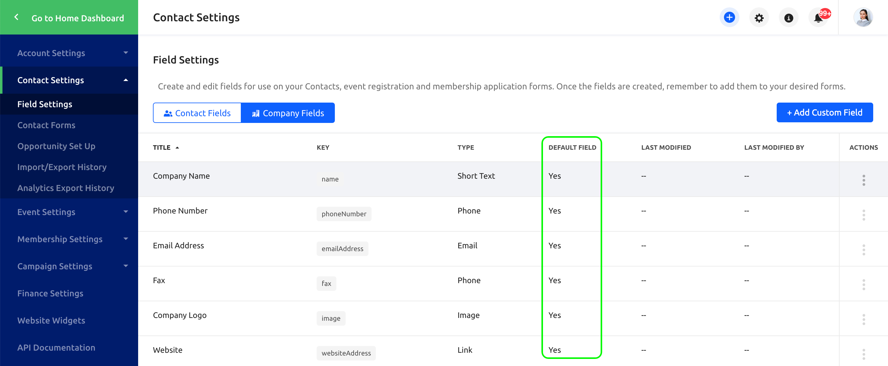
- New Default Fields Indicator: We’ve introduced a new column in the fields settings that indicates which fields are default fields. This distinction will help users differentiate between system-defined fields and those created by users.

- Field Properties for Easier Management: To simplify field management, we’ve introduced field properties. This feature allows users to view and modify field details in a more intuitive way, reducing the likelihood of creating duplicate fields.

- Enhanced Field Properties Pop-up: The look and feel of the field properties pop-up has been updated to make it more user-friendly and informative. Users will now find it easier to understand and adjust field settings.

- Preview Option for Contact Form: A preview option for the contact form has been added, enabling users to see how their changes will appear in real-time. This feature promotes a more confident and accurate form-building experience.

- Redesigned Contact Form Editing: The contact form editing experience has undergone a revamp, making it more intuitive and accessible. Users can now navigate and modify the form with greater ease.

- Improved Field Arrangement and Settings Management: We’ve reworked the arrangement of fields and settings for improved clarity and efficiency. This will help users to quickly locate and configure the desired elements.

- Highlighting Limitations and Tooltips: To ensure users are aware of the limitations associated with different field types, we’ve introduced clear highlights and tooltips. This will guide users in making informed decisions about field selection.

- Enhanced Contact Form Display: The way contact forms are displayed has been enhanced to prioritize readability. This upgrade ensures that the forms are presented in a user-friendly manner across different devices.

By implementing these changes, we’re confident that the redesigned Contacts/Application Forms & Fields Settings will provide a more user-friendly, efficient, and error-resistant platform for creating and managing fields. Our aim is to prevent the occurrence of duplicate fields, improve the overall user experience, and empower users to build effective contact forms effortlessly.


